
View Demo
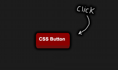
Here I am going to share the beautiful css designed 3d button which you can use for multi purposes in website/blog to make your work so awesome and professional. The button is purely designed with css. The button shows animation when users presses down on the button. In css the transition and shadow to the buttons is added to make it look more awesome. Here you can check demo.
THE CSS CODE
a.css3dbutton {
background: darkred; /* background color of button */
color: white;
text-decoration: none;
font: bold 28px Arial; /* font size and style */
position: relative;
top: 0; /* anchor main button's position */
bottom: -12px; /* Depth of 3D effect. :after pseudo element inherits this value so it's animated in Chrome. See: kizu.ru/en/pseudos */
margin-bottom: 12px;
-moz-box-shadow: 0 -15px 5px darkred inset;
-webkit-box-shadow: 0 -15px 5px darkred inset;
box-shadow: 0 -15px 5px darkred inset;
-moz-transition: all 0.2s ease-in-out;
-o-transition: all 0.2s ease-in-out;
-webkit-transition: all 0.2s ease-in-out;
transition: all 0.2s ease-in-out;
}
a.css3dbutton, a.css3dbutton:after {
display: inline-block;
padding: 10px 15px; /* vertical and horizontal padding of button */
-moz-border-radius: 8px/15px;
-webkit-border-radius: 8px/15px;
border-radius: 8px/15px;
outline: none;
}
a.css3dbutton:after { /* pseudo element to construct 3D side of button */
content: "";
position: absolute;
padding: 0;
z-index: -1;
bottom: inherit; /* Inherit main button bottom value to animate it. See: kizu.ru/en/pseudos */
left: 0;
width: 100%;
height: 100%;
background: #6e0e0c; /* background color of 3D effect */
-moz-box-shadow: 1px 0 3px gray;
-webkit-box-shadow: 1px 0 3px gray;
box-shadow: 1px 0 3px gray;
}
a.css3dbutton:hover {
-moz-box-shadow: 0 25px 5px rgba(182, 64, 61, 0.7) inset;
-webkit-box-shadow: 0 25px 5px rgba(182, 64, 61, 0.7) inset;
box-shadow: 0 25px 5px rgba(182, 64, 61, 0.7) inset;
background: #bc3835; /* background color when mouse rolls over button */
}
a.css3dbutton:active {
top: 12px; /* shift button down 12px when depressed. Change 12px to match button's "bottom" property above */
bottom: 0;
-moz-box-shadow: 0 -20px 5px darkred inset, 1px 1px 2px #eee;
-webkit-box-shadow: 0 -20px 5px darkred inset, 1px 1px 2px #eee;
box-shadow: 0 -20px 5px darkred inset, 1px 1px 2px #eee;
}
THE HTML CODE
<a href="#" class="css3dbutton">Button Name</a>
CUSTOMIZATION
After adding this code you can change the button name in shaded yellow text.
I hope you like my post please take a moment and comment your beautiful ideas.
Thank You!


0 comments