Showing posts with label Widgets. Show all posts

Thursday, November 28, 2013

CSS Flat Drop Down Menu for Blogger


                                                                    View Demo
As you know that i always tried to present some thing unique there for you peoples. Today I am going to share a new and beautiful Css Drop down menu with sub menus.It really looking too pretty and awesome and Visitors attractive. You can inspire visitors using this awesome drop down menu . Its very easy to install in your blog or website. It is Css designed menu.It consists of seven menu tabs , two tabs are drop down while others ones is flat menus. It can be customized into your mode and need.

THE CSS CODE

/*--- PROBLOG WORLD COPYRIGHTED ---*/
#menu table {border-collapse:collapse; width:0; height:0; position:absolute; top:0; left:0;}
/* Default link styling */
/* Style the list OR link hover. Depends on which browser is used */
#menu li a:hover {z-index:200; position:relative;color:#fff; background-color:#c7093e;}
#menu li:hover {position:relative; z-index:200;}
#menu li:hover > a {color:#fff; background:#c7093e;}
#menu li:hover > a.sub {color:#fff; background-color:#c7093e;}
#menu li.current a {color:#fff; background:#c7093e;}
#menu li a.sub {background: #333 url(down-arrow.gif) no-repeat right center;}
#menu li.current a.sub {color:#fff; background:#c7093e url(down-arrow.gif) no-repeat right center;;}
#menu :hover ul {left:0; top:40px; width:120px; background:#444;}
/* keep the 'next' level invisible by placing it off screen. */
#menu ul,
#menu :hover ul ul {position:absolute; left:-9999px; top:-9999px; width:0; height:0; margin:0; padding:0; list-style:none;}
#menu :hover ul :hover ul
{left:120px; top:-1px; background:#222; white-space:nowrap; width:100px; z-index:200; height:auto;}
#menu :hover ul li {margin:0; border-top:1px solid #666;}
#menu :hover ul li a {width:120px; padding:0; text-indent:10px; background:#333; color:#ccc; height:30px; line-height:30px;}
#menu :hover ul li a.fly {background:#333 url(right-arrow.gif) no-repeat right center;}
#menu :hover ul :hover {background-color:#c7093e; color:#fff;}
#menu :hover ul :hover a.fly {background-color:#c7093e; color:#fff;}
#menu :hover ul li.currentsub a {background:#c7093e; color:#fff;}
#menu :hover ul li.currentsub a.fly {background:#c7093e url(right-arrow.gif) no-repeat right center; color:#fff;}
#menu :hover ul :hover ul li a {width:100px; padding:0; text-indent:10px; background:#3e3e3e; color:#ccc;}
#menu :hover ul :hover ul :hover {background-color:#c7093e; color:#fff;}
#menu :hover ul :hover ul li.currentfly a,
#menu :hover ul :hover ul li.currentfly a:hover {background:#c7093e; color:#fff;}
/*--- PROBLOG WORLD COPYRIGHTED ---*/

THE HTML CODE

Put the code in your blog section where you want to set the menu .

<ul id="menu">
<li><a href="index.html"><b>Home</b></a></li>
<li><a href="single.html"><b>Single Level</b></a></li>
<li class="current"><a class="sub" href="dropdown.html"><b>Dropdown</b><!--[if gte IE 7]><!--></a><!--<![endif]-->
<!--[if lte IE 6]><table><tr><td><![endif]-->
<ul>
<li><a class="fly" href="#url">Dropdown one<!--[if gte IE 7]><!--></a><!--<![endif]-->
<!--[if lte IE 6]><table><tr><td><![endif]-->
<ul>
<li><a href="#url">Dropdown 1.1</a></li>
<li><a href="#url">Dropdown 1.2</a></li>
<li><a href="#url">Dropdown 1.3</a></li>
<li><a href="#url">Dropdown 1.4</a></li>
<li><a href="#url">Dropdown 1.5</a></li>
<li><a href="#url">Dropdown 1.6</a></li>
</ul>
<!--[if lte IE 6]></td></tr></table></a><![endif]-->
</li>
<li class="currentsub"><a class="fly" href="#url">Dropdown two<!--[if gte IE 7]><!--></a><!--<![endif]-->
<!--[if lte IE 6]><table><tr><td><![endif]-->
<ul>
<li><a href="#url">Dropdown 2.1</a></li>
<li><a href="#url">Dropdown 2.2</a></li>
<li class="currentfly"><a href="#url">Dropdown 2.3</a></li>
<li><a href="#url">Dropdown 2.4</a></li>
<li><a href="#url">Dropdown 2.5</a></li>
</ul>
<!--[if lte IE 6]></td></tr></table></a><![endif]-->
</li>
<li><a href="#url">Dropdown three</a></li>
<li><a href="#url">Dropdown four</a></li>
<li><a class="fly" href="#url">Dropdown five<!--[if gte IE 7]><!--></a><!--<![endif]-->
<!--[if lte IE 6]><table><tr><td><![endif]-->
<ul>
<li><a href="#url">Dropdown 5.1</a></li>
<li><a href="#url">Dropdown 2.2</a></li>
<li><a href="#url">Dropdown 3.3</a></li>
</ul>
<!--[if lte IE 6]></td></tr></table></a><![endif]-->
</li>
</ul>
<!--[if lte IE 6]></td></tr></table></a><![endif]-->
</li>
<li><a class="sub" href="dropline.html"><b>Dropline</b><!--[if gte IE 7]><!--></a><!--<![endif]-->
<!--[if lte IE 6]><table><tr><td><![endif]-->
<ul>
<li><a href="#url">Dropline one</a></li>
<li><a href="#url">Dropline two</a></li>
<li><a href="#url">Dropline three</a></li>
<li><a href="#url">Dropline four</a></li>
<li><a href="#url">Dropline five</a></li>
<li><a href="#url">Dropline six</a></li>
</ul>
<!--[if lte IE 6]></td></tr></table></a><![endif]-->
</li>
<li><a class="sub" href="flyout.html"><b>Flyout</b><!--[if gte IE 7]><!--></a><!--<![endif]-->
<!--[if lte IE 6]><table><tr><td><![endif]-->
<ul>
<li><a href="#url">Flyout one</a></li>
<li><a href="#url">Flyout two</a></li>
<li><a href="#url">Flyout three</a></li>
<li><a href="#url">Flyout four</a></li>
</ul>
<!--[if lte IE 6]></td></tr></table></a><![endif]-->
</li>
<li id="support"><a href="support.html"><b>Support</b></a></li>
<li id="contact"><a href="contact.html"><b>Contact</b></a></li>
</ul>

HOW TO ADD THIS INTO BLOGGER AS WIDGET

Put the given css codes in between style tags and after that put html codes. Then
Go to Blog Title Layout Add Widget Html/JavaScript.Past the Code 
The code will be look like that...
<style>
Given css codes
</stle>
Given HTML Codes

I hope you will find my post help full. Please comment your bright ideas.Thank you!

Read more

Monday, November 25, 2013

CSS 3D Button with effects For Blogger


                                                                   View Demo
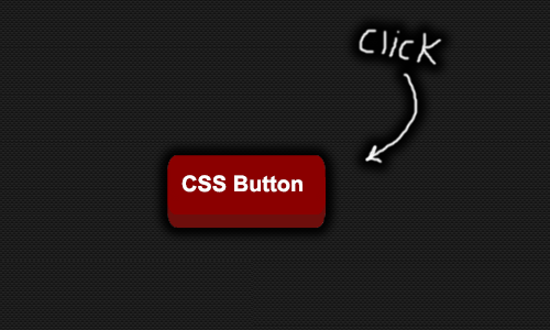
Here I am going to share the beautiful css designed 3d button which you can use for multi purposes in website/blog to make your work so awesome and professional. The button is purely designed with css. The button shows animation when users presses down on the button.  In css the transition and shadow to the buttons is added to make it look more awesome. Here you can check demo.

THE CSS CODE

a.css3dbutton {
    background: darkred; /* background color of button */
    color: white;
    text-decoration: none;
    font: bold 28px Arial; /* font size and style */
    position: relative;
top: 0; /* anchor main button's position */
    bottom: -12px; /* Depth of 3D effect. :after pseudo element inherits this value so it's animated in Chrome. See: kizu.ru/en/pseudos */
margin-bottom: 12px;
    -moz-box-shadow: 0 -15px 5px darkred inset;
    -webkit-box-shadow: 0 -15px 5px darkred inset;
    box-shadow: 0 -15px 5px darkred inset;
    -moz-transition: all 0.2s ease-in-out;
    -o-transition: all 0.2s ease-in-out;
    -webkit-transition: all 0.2s ease-in-out;
    transition: all 0.2s ease-in-out;
}
a.css3dbutton, a.css3dbutton:after {
    display: inline-block;
    padding: 10px 15px; /* vertical and horizontal padding of button */
    -moz-border-radius: 8px/15px;
    -webkit-border-radius: 8px/15px;
    border-radius: 8px/15px;
    outline: none;
}
a.css3dbutton:after { /* pseudo element to construct 3D side of button */
    content: "";
    position: absolute;
    padding: 0;
    z-index: -1;
    bottom: inherit; /* Inherit main button bottom value to animate it. See: kizu.ru/en/pseudos */
    left: 0;
    width: 100%;
    height: 100%;
    background: #6e0e0c; /* background color of 3D effect */
    -moz-box-shadow: 1px 0 3px gray;
    -webkit-box-shadow: 1px 0 3px gray;
    box-shadow: 1px 0 3px gray;
}
a.css3dbutton:hover {
    -moz-box-shadow: 0 25px 5px rgba(182, 64, 61, 0.7) inset;
    -webkit-box-shadow: 0 25px 5px rgba(182, 64, 61, 0.7) inset;
    box-shadow: 0 25px 5px rgba(182, 64, 61, 0.7) inset;
    background: #bc3835; /* background color when mouse rolls over button */
}
a.css3dbutton:active {
    top: 12px; /* shift button down 12px when depressed. Change 12px to match button's "bottom" property above */
    bottom: 0;
    -moz-box-shadow: 0 -20px 5px darkred inset, 1px 1px 2px #eee;
    -webkit-box-shadow: 0 -20px 5px darkred inset, 1px 1px 2px #eee;
    box-shadow: 0 -20px 5px darkred inset, 1px 1px 2px #eee;
}

THE HTML CODE


<a href="#" class="css3dbutton">Button Name</a>

 CUSTOMIZATION


After adding this code you can change the button name in shaded yellow text.
I hope you like my post please take a moment and comment your beautiful ideas.
Thank You!
Read more

Thursday, November 21, 2013

Metro Style Social Icons Widgets For blogger


                                                                       View Demo

Metro Style Social Icon Widgets For blogger

Hi blogians here i am going to show you how to add metro style social icons widget into your blogg. Metro Style was being introduced by Microsoft in windows 8 and it is most Modern style in computer world today. Its looks really amazing and so awesome visitors likes it so much. Here the widgets consist of four square social icons. As shown in given picture.

Adding the widget in Layout

Go to Blog Title Layout Add Widget Html/JavaScript.Past the Below Code
<style>.socialicons_widget_sidebar li {    float: left;    width: 147px;    height: 147px;    margin: 0 0 0 0;    padding: 0 0 0 0;    border-bottom: none;}.socialicons_widget_sidebar li a {    line-height: 1px;    display: block;}.socialicons_widget_sidebar li a:hover img {    -webkit-opacity: 0.8;    -moz-opacity: 0.8;    opacity: 0.8;}.socialicons_widget_sidebar li a span {    display: none;}.socialicons_widget_sidebar li.rss-icon {    margin: 0 6px 6px 0;}.socialicons_widget_sidebar li.facebook-icon {    margin: 0 6px 0 0;}</style> <div id="socialicons_widget_sidebar-2" class="row widget socialicons_widget_sidebar"><ul style="margin: 0 0 0 0; padding: 0 0 0 0; list-style: none;"> <li class="twitter-icon" style="margin-left: 155px;"><a target="_blank" href="http://www.twitter.com/#" rel="nofollow"><img src="https://blogger.googleusercontent.com/img/b/R29vZ2xl/AVvXsEjfEmmQGGUTFaMmqBwKp9OTjDrbZBAKdABYZemlnCiV0UFvjz0NkwB03gSR5YV6rYeGnXLRJrFVjgmDvW497zVDW0okQwyZzST7-i8DXwZHaFWnzFE-MzyXJVapEPpN9y_Oz9lItGja-GlO/s1600/twitter.png" width="147" height="147" /><span>Twitter</span></a></li> <li class="facebook-icon" style="margin-top: -146px;"><a target="_blank" href="http://www.facebook.com/#" rel="nofollow"><img src="https://blogger.googleusercontent.com/img/b/R29vZ2xl/AVvXsEjTdoUHKmWA5XwYPslpidiFV-2qzDpvW-0-SiRGZ5xSMysm_80ZD_E5La24Cw1n9dxh2RkevuLSOR6dkcu9x6GmHd465ekf_9Ra7FHFRIOH1cU5uHrt8GGNteYqYJcQbykTIEkZo6s-PcVk/s1600/facebook.png" width="147" height="147" /><span>Facebook</span></a></li> <li class="rss-icon" style="margin-top: 7px;"><a target="_blank" href="http://feeds.feedburner.com/#" rel="nofollow"><img src="https://blogger.googleusercontent.com/img/b/R29vZ2xl/AVvXsEjTAaXovCm7-s_DmMFtv-c2GkkINs6Cbc8XkOqI8yZMOY_CEEudrRbQbx9NKqhr5qxzn1Xm1bgVw-EHcESUk9PX8ww8d2CbMi39z2U9AaNP0Cv11vykQ7v31eqM4lFL_NvAy0OH3D2CStN4/s1600/rss.png" width="147" height="147" /><span>Rss Feed</span></a></li> <li class="google-icon" style="margin-left: 155px;margin-top: -153px;"><a target="_blank" href="https://plus.google.com/u/0/#"><img src="https://blogger.googleusercontent.com/img/b/R29vZ2xl/AVvXsEgjhGhJH_4klGtJ4X9puR7QzkyUiqldijamytovf6Ejm4oVaE5FEjboIeYjxu_5BmkU2RLPtJgJKs0nlBM881weyLg-zmQCljjANIH8jXQCftrY6dIZH0Nw_IkwBesUgXxKnyUC-Des2WjY/s1600/google.png" width="147" height="147" /><span>Google+</span></a></li> </ul></div>

Customization

Once you have added the code change the red shaded text and save it. You are now done and visitors will see this awesome widget on your blog. Thank you!

Read more